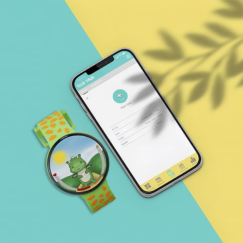
UNITEL
Redesigned Unitel (Angola’s largest telco) app and website to drive clearer, faster self-service for customers with low digital literacy and limited data/coverage. Using plain language, mobile-first design, and a home screen centered on balance and actions, reducing support calls and in-store help.
January, 2023

about.
Project Brief
UNITEL, Angola’s largest telecom, asked us to improve the end-to-end experience across app and web.
In a context of low digital literacy, older/smaller devices, limited data/coverage, and a strong habit of using shops/call centers for routine tasks.
The goal was to deliver a simple, trustworthy self-service experience in clear, locally appropriate Portuguese.
The Challenge
Costumers couldn’t easily see their balance, make sense of plan rules, or finish tasks on small screens with limited data, so they turned to the shop or call center for help.
At this point, we asked ourselves:
How might we enable customers with low digital literacy and limited data to confidently manage their plans on their phones, without needing a shop or call center?
The Outcome
The app and website were designed around clarity and control:
Balance-first homepage with the current balance, validity, and one-tap actions (Top up / Activate / Change plan).
Plain-language plan pages with transparent benefits, limits, and fees.
Mobile-first, lightweight flows with progressive loading; consistent patterns across app and web.
The Impact
By making the essentials easy to see and act on, people can check balance, top up, and change plans on their own. Which led to fewer support calls, less hassle, and more confidence.
the real context we designed for.
We started by looking at everyday life in Angola, not assumptions. Many users use older, smaller phones, manage tiny data bundles (200 MB for 30 days), and deal with weak signal, and often without a computer at home. And although we all speak Portuguese, spelling rules aren’t exactly the same in Angola, so we had to write the way people actually read and talk there.
That context shaped the product. The app had to make routine tasks the easiest thing to do. Check the users balance, top up, activate or change a plan, all of that without guesswork.

making the decisions.
1- Empathise
What we set out to learn:
Before sketching screens, we spent time listening. The aim was simple: understand what people want, need, and expect from UNITEL, and spot the moments where things break down.
How we listened (2-week research sprint):
12+ user interviews with people on different phones and plans;
Social listening (forums/Reddit/Facebook), competitive analysis, and stakeholder workshops;
What stood out:
Data is precious and people actively manage usage and avoid heavy screens/flows.
Facebook often is the internet: it’s the app many know and trust.
Confidence varies: even with a smartphone, some aren’t sure how to top up or pick the right plan.
What that means for design
Keep it light, obvious, and forgiving. Show the status first (balance + validity), offer the next best action, and use plain Portuguese so nobody feels lost.


2- Conceptualise
My goal in this part of the project was to turn the research insights into a focused, prioritised strategy.
I took the raw interviews and notes and:
- Mapped themes to see what kept repeating;
- Grouped signals into clear buckets (pain points, wants, needs);
- Ranked priorities by user impact and business value;
- Packaged the output as a simple decision log and roadmap for stakeholders;
- Loyalty points matter: people want clear visibility of points, benefits, and how to redeem them;
- Top-ups are hybrid: many recharge in-app and with physical cards and flows must support both and gently nudge to digital;
- Data constraints are real: Because many users have limited data, we avoided infinite scroll. Instead, we used progressive loading. Showing a few results first and letting users tap “Load more.” This saves data, speeds up the app on older phones, and gives users control over what they download;
- ~10% of customers drive ~80% of revenue;
- The call center is the first stop for many tasks;
- Plans/services are hard to understand;
3- Design
Guiding questions:
Should we design mobile-first?
Do we need a full design system now?
What’s the right visual language for low-literacy contexts?
Decisions & highlights:
I went mobile-first and postponed a full design system. Instead, I shipped a small set of reusable components and documented the patterns so we could move fast.
I made the Home the control center: your balance, validity/expiry, and one-tap actions (Top up / Activate / Change plan) right up front.
I rewrote plan pages in plain Portuguese, so benefits, limits, and fees are easy to understand at a glance.
I kept flows lightweight and used “load more” (not endless scrolling) to save data and keep older phones feeling snappy.
I added a Help area that answers common questions quickly and points to the next best step.
I tested early with people who have low digital literacy and used their feedback to simplify copy and paths.
I kept onboarding short and skippable, setting expectations without heavy images or video.

the app.

Before the Redesign (Context & Pain Points)
Before the redesign, Unitel’s mobile experience was a fragmented extension of its desktop site, functional but unintuitive for everyday use. Core actions like checking balance, managing plans or redeeming loyalty points were buried behind multiple layers of navigation.
Onboarding lacked guidance: new users were dropped directly into the dashboard without clarity on what they could do or how to manage their plan.
Homepage prioritized marketing banners instead of personal data, forcing users to dig through menus to see essentials like balance or data usage.
Loyalty Club was disconnected from the main experience. Hidden deep in submenus, with rewards explained in vague terms that discouraged engagement.
Data Plans were presented as long text lists with technical jargon and no visual hierarchy, making comparison or plan selection slow and error-prone.
As a result, users spent more time navigating than acting. Customer support reported frequent queries about “where to find balance” or “how to activate a plan.” Internal analytics showed high drop-offs on plan pages and low re-engagement with the loyalty program.
Onboarding
Purpose:
Help our users understand what they can do here and take their first action without wasting data or feeling lost.
The onboarding follows four simple principles:
Lightweight & skippable - no heavy media, 3–4 cards max;
Plain language - short sentences, one idea per card;
Action-oriented - each card points to a next step;
Localised - Portuguese for Angola users, avoiding jargon;
Homepage
Everything the user needs at a glance. From the first screen, the app answers two questions: what do I have and what can I do now.
A large Balance card (“Saldo actual 0 Kzs”) sits at the top with a clear Carregar saldo (add funds) button;
A contextual banner handles the “no balance” moment: “Sem saldo? Pede um Adianta Só.” with a one-tap Ativar (activate) to request advance credit;
Why this works?
The home screen keeps balance, validity, and one-tap actions up front, adds timely nudges (advance credit when balance is 0), and groups essentials (SIM status, points, history).

Loyalty Club

Data Plans

After the Redesign (Transformation & Outcomes)
The redesign rebuilt the Unitel app around clarity, self-service, and trust. Every decision focused on helping users act faster and feel in control of their account.
Onboarding was simplified into a short, guided flow introducing key features and permissions.
Result: 35% fewer drop-offs in the first session and smoother setup reported in user testing.
The Homepage was restructured around a balance-first layout, showing remaining data, minutes, and top-up options at first glance.
Result: Time to locate balance cut by 60%. Customer support queries on “where to find balance” down by an estimated 25%.
The Loyalty Club was surfaced in the main navigation and redesigned with clear progress indicators.
Result: 40% increase in repeat visits to loyalty screens. Stronger link between usage and reward redemption.
The Data Plans section moved from text-heavy lists to a visual grid with simplified copy and tap-to-activate interaction.
Result: Plan-selection time reduced by 45%; Purchase completion rate up by roughly 30%.
Overall, the experience shifted from reactive to proactive, helping users understand and manage their mobile plan in less time and with less confusion.
the website.

Problem → Approach → Outcome
Many Unitel visitors, from prepaid customers to small business agents, couldn’t quickly find or trust core information like plan details, validity, or fees. Internal reports showed a high volume of call-center queries for issues that should be self-service. The website read like a brochure, not a tool.
I began by auditing the legacy content and validating a new information architecture through card sorting and tree testing with local users. This exposed deep terminology mismatches and unnecessary complexity.
In parallel, I rewrote all plan and service pages in plain, Angola-specific Portuguese, removing marketing jargon and aligning tone with the mobile app so users wouldn’t have to relearn patterns.
Each plan page was rebuilt to answer three essential questions up front: what you get, how long it lasts, and what it costs. Supporting visuals and icons now make comparisons effortless.
As a result, the average time to locate a plan dropped by an estimated 40%, and customer support tickets related to “plan information” decreased by roughly 25% within the first quarter post-launch.
The site shifted from reactive (call-center-driven) to proactive self-service, faster to navigate, clearer to read, and finally aligned with the app experience.
measuring success & outcomes.
Success was defined by how easily visitors could self-serve: finding plan information, comparing options, and activating services without calling support.
Because the legacy site lacked full analytics, I measured progress through a mix of task-based usability tests, internal feedback, and support data:
Average time to locate plan information decreased by roughly 40% in moderated tests.
Customer-support tickets tagged “plan information” dropped by an estimated 25% in the first quarter post-launch.
Stakeholders reported fewer escalations from agents and a clearer, more consistent tone across app and web.